Tala Collections Branding
Tala Collections is an online retail brand dedicated in making every day beautiful with a focus on fair-trade products that are very well curated in terms of craftmanship and contemporary aesthetics.
We where assigned by Tala to redesign their word-mark, curate their visual identity and come up with detailed brand guidelines for their social media content. The key visual, key brand culture aspect behind all of our deliverables was a fine balance between traditional craftsmanship and modern high end aesthetics.
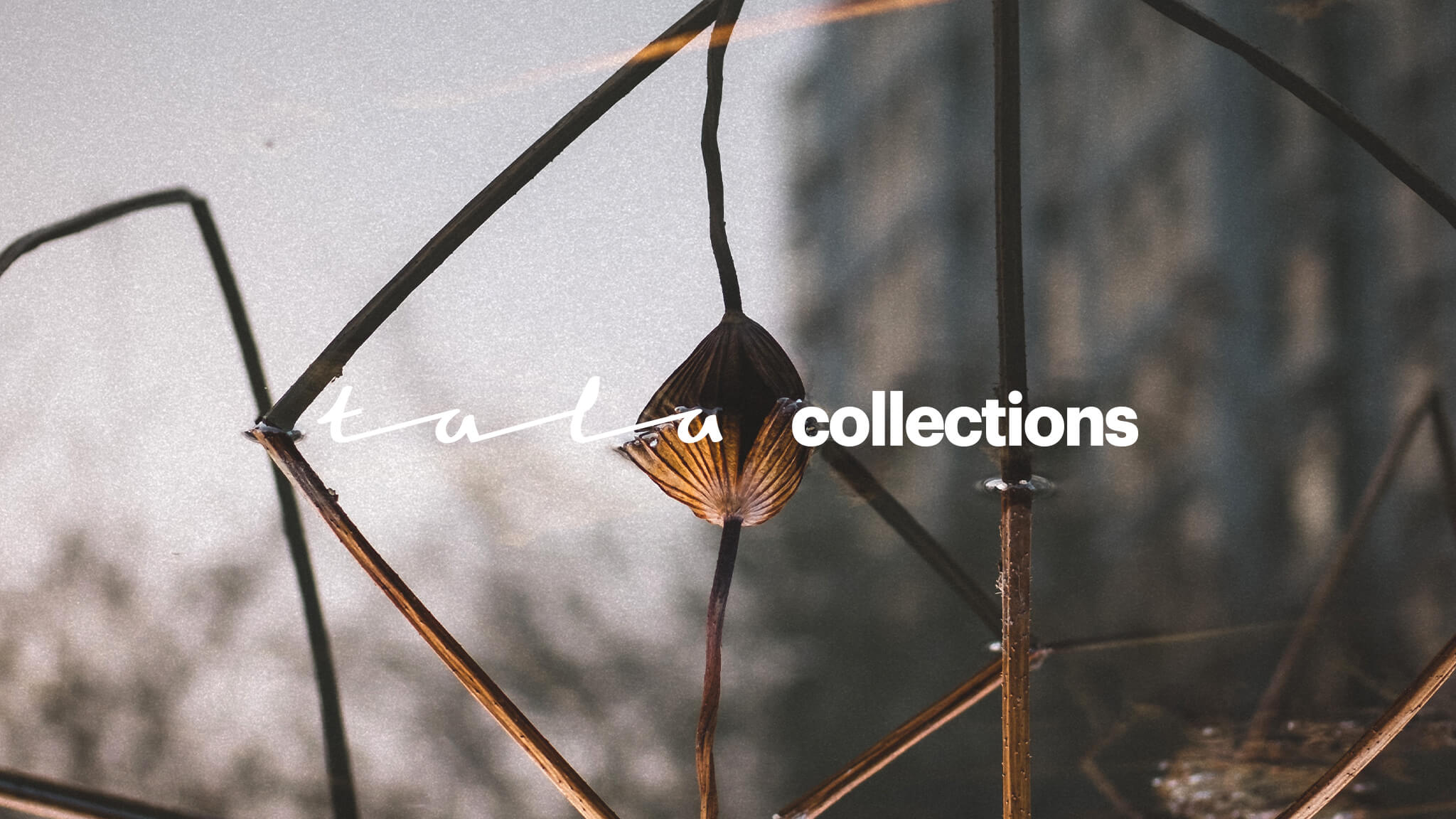
The new Tala word-mark, logotype aims to resemble a handwritten signature like form. Still this freestyle typography approach gets seamlessly interrupted by straight, almost mechanically drawn lines contrary to hand-drawn calligraphy.
The brand culture balance between tradition and modernity is enhanced even more by the use of contemporary grotesque typography that compliments all other supportive branding outputs such as gift cards, product price tags, business cards etc.
Two different colour palettes where introduced to the brand. The core colour palette includes a limit of two brand colours that feel natural and earth-like, whereas the brand supplementary colour palette includes a wide range of fresh and vibrant colour combinations. This colour study gets applied through the brands instagram channel by the use of specific props and backgrounds for their brand photography.
LIST OF SERVICES
Brand Strategy
Visual Brand Guidelines
Photography Guidelines
Wordmark re-design
Instagram Curation
Brand Collateral


we would love to hear from you about anything you would like to share
we would love to hear from you about anything you would like to share
we would love to hear from you about anything you would like to share
we would love to hear from you about anything you would like to share
we would love to hear from you about anything you would like to share
feel free to mail us at
info@orightstudio.com
call us at +30 210 72 577 86
feel free to mail us at
info@orightstudio.com
call us at +30 210 72 577 86
feel free to mail us at
info@orightstudio.com
call us at +30 210 72 577 86
feel free to mail us at
info@orightstudio.com
call us at +30 210 72 577 86
feel free to mail us at
info@orightstudio.com
call us at +30 210 72 577 86
© 2024 oright studio
© 2024 oright studio
© 2024 oright studio
© 2024 oright studio
© 2024 oright studio