Visual branding and applications
for IOKA technical
Visual branding and applications for
IOKA technical
Visual branding and applications for
IOKA technical
Visual branding and applications
for IOKA technical
Visual branding and applications
for IOKA technical
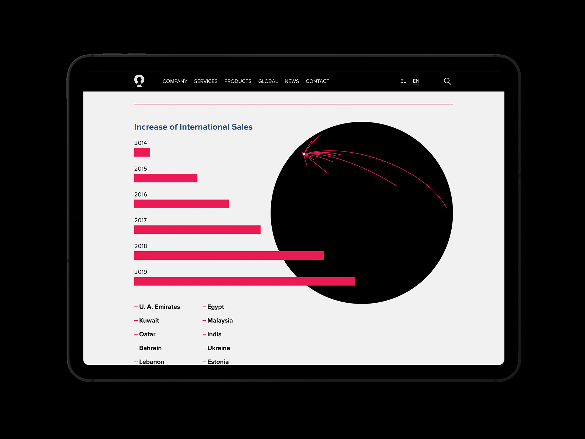
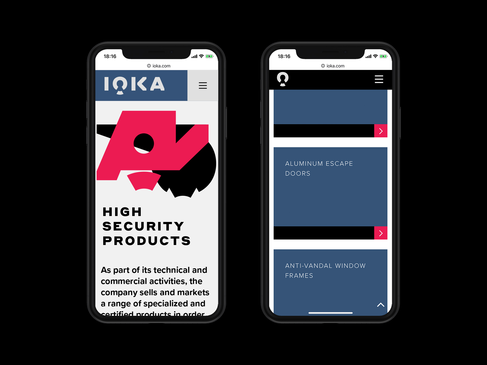
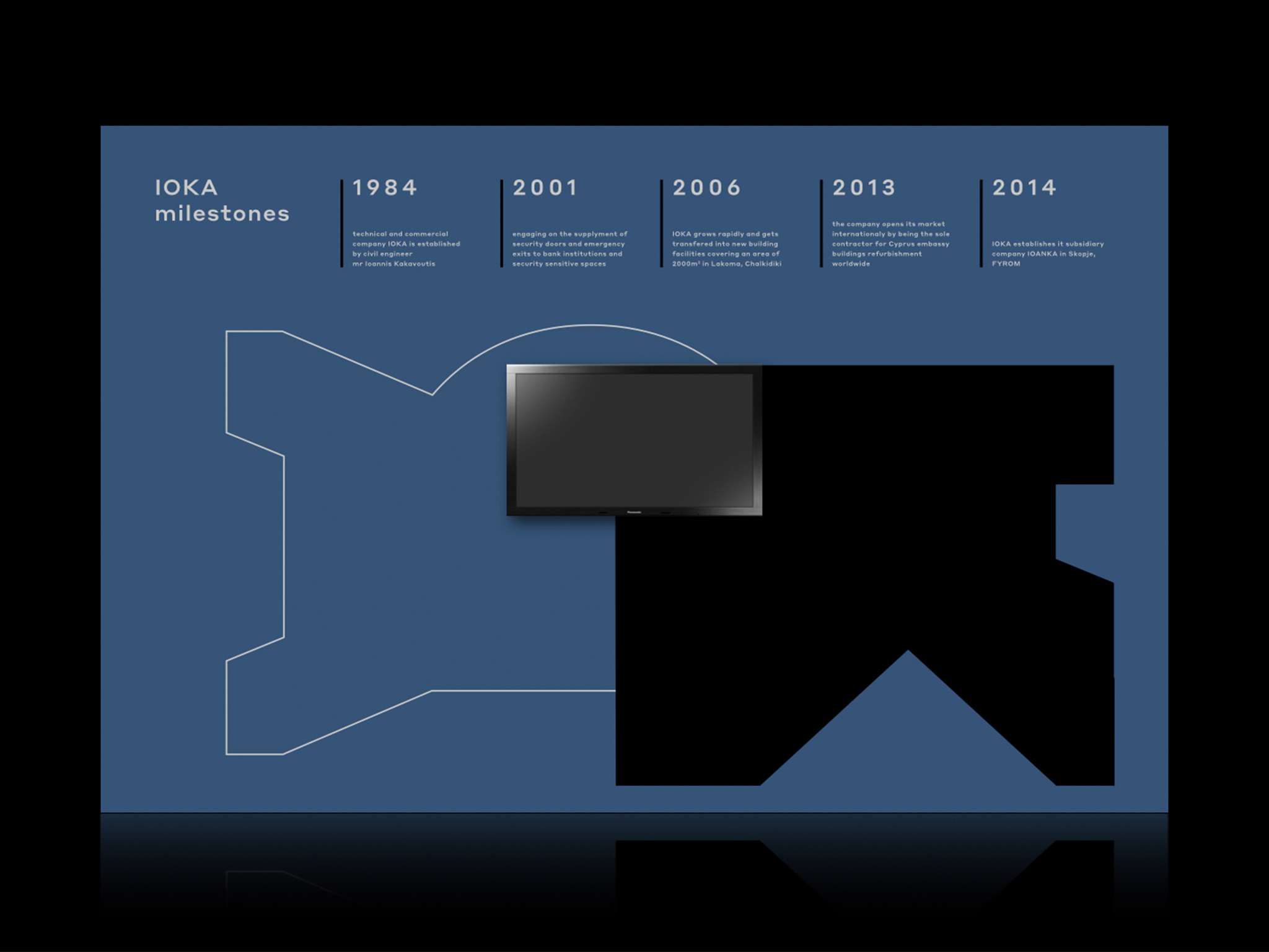
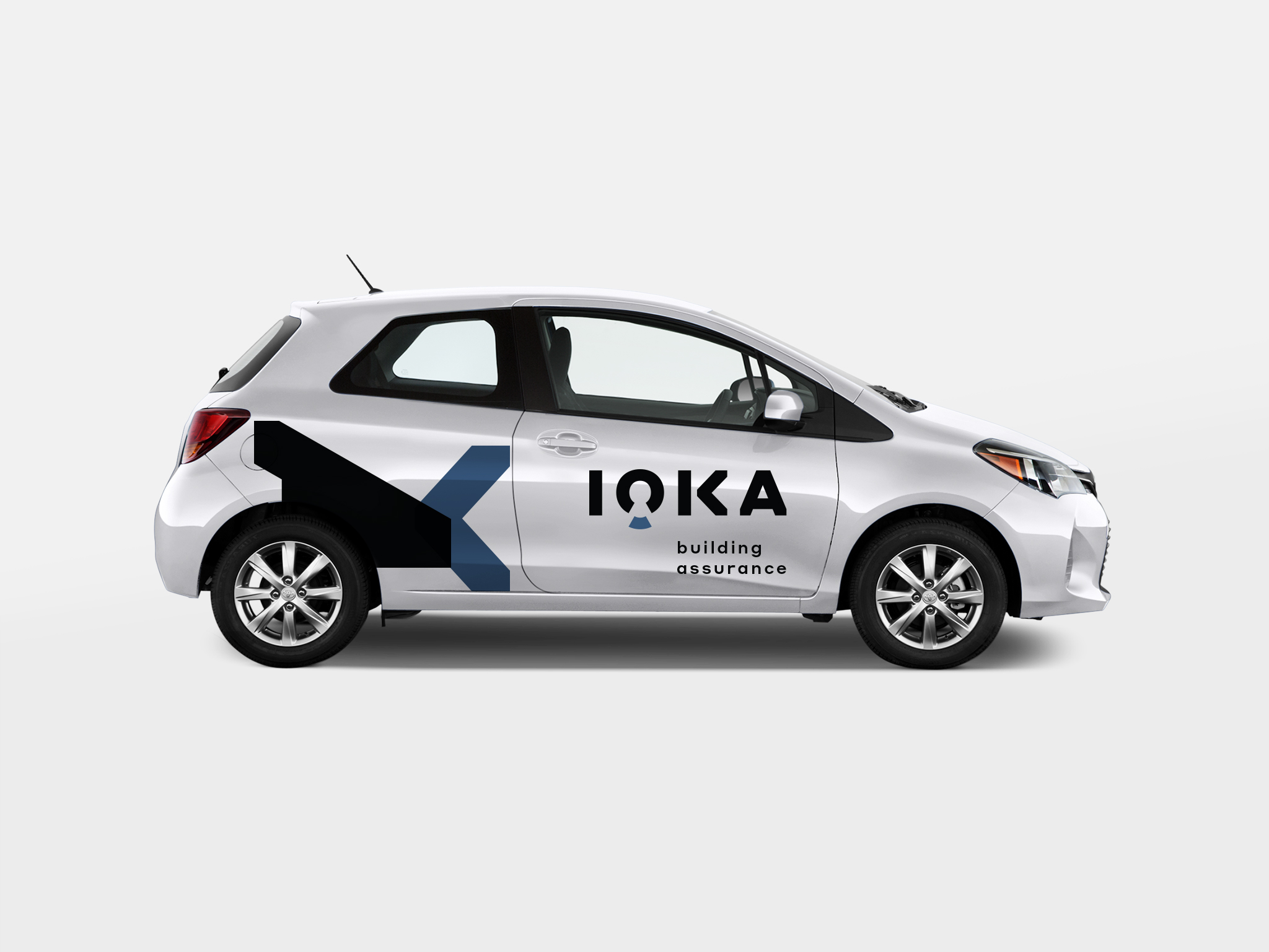
IOKA is a technical company specialized in building high security spaces and in the development and construction of bulletproof structures such as bank counters, doors and car windows.
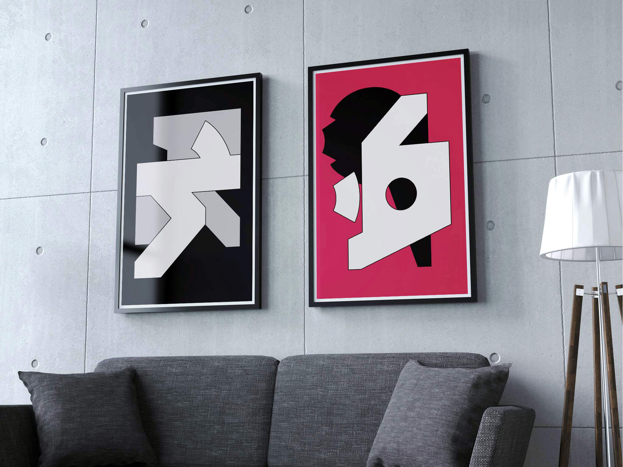
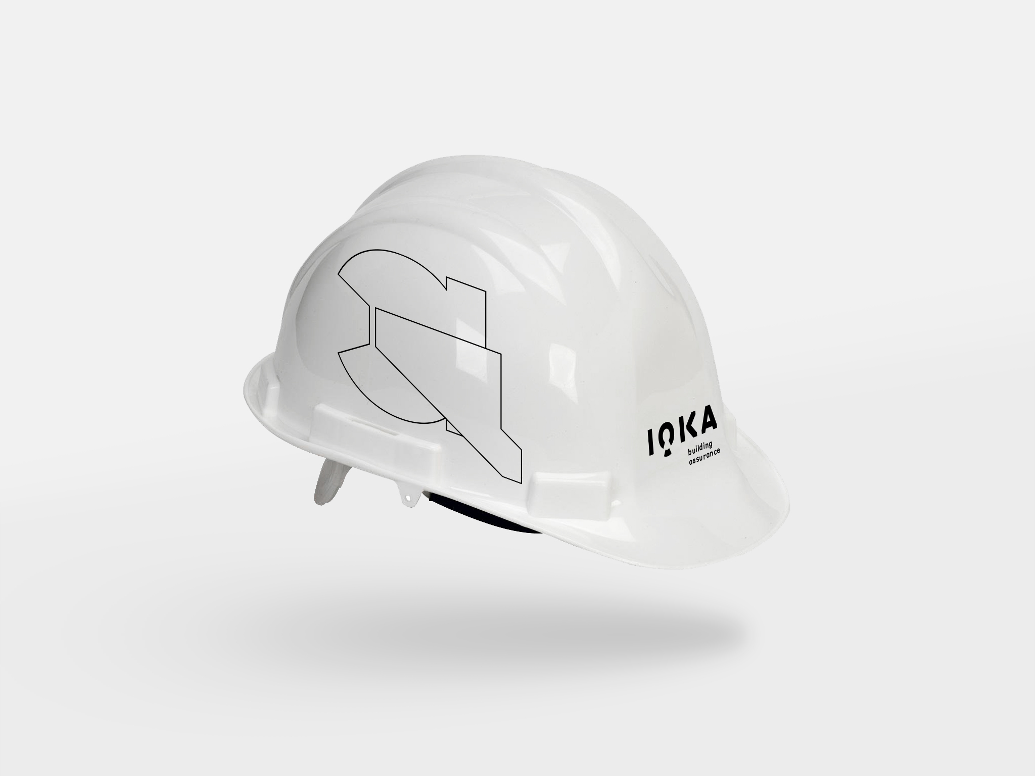
IOKA communicates its specific business nature with a word-mark that incorporates the symbol of a lock in order to correspond to the concept of security. Together with this word-mark a very specific tag line was created in order to really pin point what IOKA's business is about.
The vast majority of IOKA's clientele comes from the banking sector. A sector that is very sensitive when it comes to matters of security and trust. Therefore IOKA's corporate identity look and feel had to have a visual edge for stability and institutional status, without being "institutionally bland".




we would love to hear from you about anything you would like to share
we would love to hear from you about anything you would like to share
we would love to hear from you about anything you would like to share
we would love to hear from you about anything you would like to share
we would love to hear from you about anything you would like to share
feel free to mail us at
info@orightstudio.com
call us at +30 210 72 577 86
feel free to mail us at
info@orightstudio.com
call us at +30 210 72 577 86
feel free to mail us at
info@orightstudio.com
call us at +30 210 72 577 86
feel free to mail us at
info@orightstudio.com
call us at +30 210 72 577 86
feel free to mail us at
info@orightstudio.com
call us at +30 210 72 577 86
© 2024 oright studio
© 2024 oright studio
© 2024 oright studio
© 2024 oright studio
© 2024 oright studio