Branding, corporate and spatial design applications for the first all world vegan cuisine restaurant in Thessaloniki, Greece.
Branding, corporate and spatial design applications for the first all world vegan cuisine restaurant in Thessaloniki, Greece.
Branding, corporate and spatial design applications for the first all world vegan cuisine restaurant in Thessaloniki, Greece.
Branding, corporate and spatial design applications for the first all world vegan cuisine restaurant in Thessaloniki, Greece.
Branding, corporate and spatial design applications for the first all world vegan cuisine restaurant in Thessaloniki, Greece.
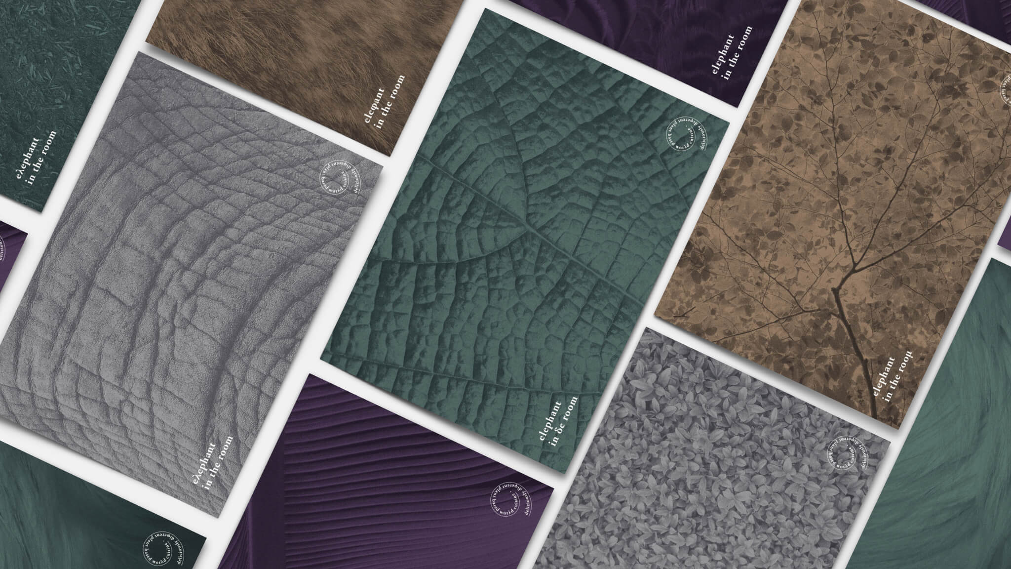
The concept behind the branding aims to compliment what the name of the restaurant suggests. That there is something present that we all notice and get bothered by, but we actually do nothing about. We choose to squeeze by it and get along with it, same as we do with the overconsumption of meat. We know its wrong, but we turn a blind eye to it.
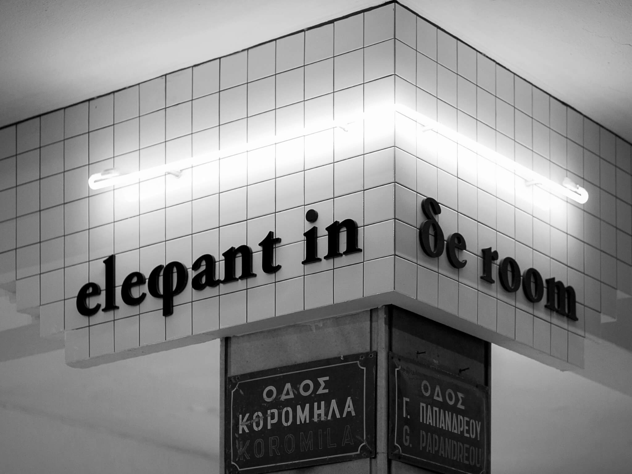
The peculiar graphic result that comes through the use of two alphabets also compliments the restaurants world cuisine. The interior design of the restaurant was designed by Danai Kehagia.
photos: Stefanos Tsakiris
The concept behind the branding aims to compliment what the name of the restaurant suggests. That there is something present that we all notice and get bothered by, but we actually do nothing about. We choose to squeeze by it and get along with it, same as we do with the overconsumption of meat. We know its wrong, but we turn a blind eye to it.
The peculiar graphic result that comes through the use of two alphabets also compliments the restaurants world cuisine. The interior design of the restaurant was designed by Danai Kehagia.
photos: Stefanos Tsakiris
The concept behind the branding aims to compliment what the name of the restaurant suggests. That there is something present that we all notice and get bothered by, but we actually do nothing about. We choose to squeeze by it and get along with it, same as we do with the overconsumption of meat. We know its wrong, but we turn a blind
eye to it.
The peculiar graphic result that comes through the use of two alphabets also compliments the restaurants world cuisine. The interior design of the restaurant was designed by
Danai Kehagia.
photos: Stefanos Tsakiris
The concept behind the branding aims to compliment what the name of the restaurant suggests. That there is something present that we all notice and get bothered by, but we actually do nothing about. We choose to squeeze by it and get along with it, same as we do with the overconsumption of meat. We know its wrong, but we turn a blind eye to it.
The peculiar graphic result that comes through the use of two alphabets also compliments the restaurants world cuisine. The interior design of the restaurant was designed by Danai Kehagia.
photos: Stefanos Tsakiris
The concept behind the branding aims to compliment what the name of the restaurant suggests. That there is something present that we all notice and get bothered by, but we actually do nothing about. We choose to squeeze by it and get along with it, same as we do with the overconsumption of meat. We know its wrong, but we turn a blind eye to it.
The peculiar graphic result that comes through the use of two alphabets also compliments the restaurants world cuisine. The interior design of the restaurant was designed by
Danai Kehagia.
photos: Stefanos Tsakiris


we would love to hear from you about anything you would like to share
we would love to hear from you about anything you would like to share
we would love to hear from you about anything you would like to share
we would love to hear from you about anything you would like to share
we would love to hear from you about anything you would like to share
feel free to mail us at
info@orightstudio.com
call us at +30 210 72 577 86
feel free to mail us at
info@orightstudio.com
call us at +30 210 72 577 86
feel free to mail us at
info@orightstudio.com
call us at +30 210 72 577 86
feel free to mail us at
info@orightstudio.com
call us at +30 210 72 577 86
feel free to mail us at
info@orightstudio.com
call us at +30 210 72 577 86
© 2024 oright studio
© 2024 oright studio
© 2024 oright studio
© 2024 oright studio
© 2024 oright studio